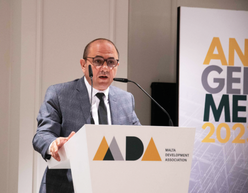
When the MDA was formed circa 12 years ago, its objective was to represent Malta’s developers. Yet, with the passage of time, the Association evolved into representing the industry’s entire spectrum of service and product deliverables and results derived therefrom. It was thus time to tune the MDA logo into better presenting this unified responsibility.
There is in fact a strategic reason which prompted the Council to agree upon this advancement. As the MDA now represents an additional 11 sections apart from its original representation of property developers, this adaptation is projecting that all elements pertaining to construction, development and property are now nestling within the Association’s protective wings; not just in how a building is planned, built and finished, but moreover in how its inhabitants and visitors interact within it and throughout its external surroundings, and ultimately, how Malta’s citizens will benefit from that environmental embellishment which is prompted by urbanisation improvement. As Michael Stivala; President of the MDA explains, “we felt it was high time that the Association takes a new additional step forward where it is presented in its factual industry representations”.

A further vital element in the logo adaptation is that it is also symbolising the focus shift from the developers to the developments; “from the market players to the industry itself”.
The logo’s was tasked to DNA Studio; of the Daaa Haus Group. Their design team was personally headed by the Group’s Managing Founder Keith Pillow, who explained “we wanted to present a design which is based on simple geometry; the basis of architecture, and we were inspired by Milan’s Bruno Munari in the creation of the simple shapes and circles which embody the MDA logo.”
“we felt it was high time that the Association takes a new additional step forward where it is presented in its factual industry representations”
Its triangles and curves represent various building elements whilst the yellow-tinted colour represents heritage and limestone, grey represents modern building techniques and advancements, and green represents the need to encourage more public spaces and environmental embellishment into development executions.
That the green is both central to the logo as well as to the three triangles evidences the MDA’s belief that property development must be supported by the country’s greening.

Comment